
- Choosing Typefaces 1
- Choosing Typefaces 2
- Historic Typefaces and Letterforms
- Letterform Optical Illusions
- Matching Typefaces
- OldStyle or Non-lining Figures (numbers)
- 20 Classic Typefaces
- Type Variables

Letterforms: Typeface Design from Past to Future Hardcover – Illustrated, July 3, 2018 by Timothy Samara
Letterform literally translates to mean the form of letters. To truly understand what this means and what the specific characteristics of letterform are, we must first understand the basic design relationship between Form and Content.
The very fact that there is both FORM and CONTENT is one of the factors that distinguishes Design from mere Decoration. At the most basic level, FORM is HOW something looks and Content is WHAT it is. So, FORM is being addressed when we are considering options of color, media, material, size, shape, texture, style, etc.—the aesthetic. Virtually any decision that will determine of affect the LOOK of the thing being created. That thing could be a sculpture, a poster, a painting or a letter of the alphabet. So, some specific examples of variables that affect the FORM of letters are stroke weight, type of serif, x-height, scaling, posture, etc.
By comparison, CONTENT is created when we are considering the purpose, message, meaning, information, facts, sequence, story telling, etc. The design concept of Form Follows Function is basically saying that the look (FORM) of the thing being created is not the first thing to consider. Instead the designer must first have a solid understanding of the purpose or message (CONTENT) and then make the aesthetic decisions that will shape the FORM.
So, back to letterform. It follows from above that letterform is then, not meaning, message, purpose—CONTENT. But instead letterform is concerned with any and all the individual characteristics or variables that influence the aesthetic look of letters. We see the result of some of the infinite possible combinations of these typographic variables as different typeface families, and even further as fonts within a type family. We also see that different combinations of variables can create, add to, or influence different feelings or moods and therefore enhance or influence the overall design message that may also include images, style of layout, choice of media or material, physical location/context, color psychology, etc.
A type designer is very aware of these potential effects of manipulating the variables that create letterform (and also the above mentioned relationship between FORM and CONTENT). Because of this, a type designer is rarely (if ever) designing a typeface simply to create a “cool” or “pretty” typeface. Instead it would be much more common to have a design goal in mind such as “more readable on the computer screen” or “evoke contemporary technology), or even “sturdy readable and subtle personality”, etc. Luckily for the rest of us, type designers have created millions of typefaces for us to choose from with these goals in mind. However, we do need to be aware of the same variables that they (the type designer) tweaked in specific combinations for specific effects. With this awareness we can then make intelligent design decisions when choosing type and pairing it with or complimenting the overall design message.
|
|
||
|---|---|---|
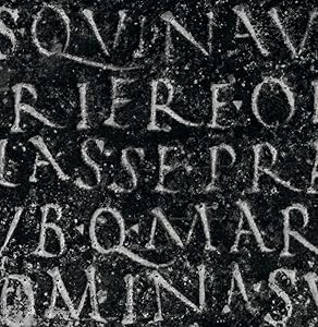
“HeritageThe modern alphabet’s standardized shapes and nuanced details are the culmination of a 10,000-year progression from pure image making for representation to a notational system of abstract symbols, or writing. Its roots lie in the day-to-day recording of market transactions and inventories of grains and livestock; over millenia it has evolved into a sophisticated medium whose visual characteristics, in the stylistic qualities of one typeface or another, capture the loftiest thoughts and transmit them from present to future—not only in the functional sense, but metaphorically coloring them for readers. Crafting an effective typeface by today’s aesthetic standards first depends on knowing how those standards came to be, and why. |
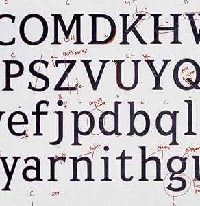
LegaciesOver time, like any other discipline with a long history, typeface design has developed a set of conventions. Some of these are related to how characters—letters, numerals, punctuation, and glyphs—are structured for clear recognition and legibility; others have to do with cultural expectations of what makes a comfortable, readable style, or how a particular style conveys emotions feelings or even appears ‘beautiful,’ based on historical context. And, of course, all of the parts of a typeface, from character shapes to individual components in each form, have names given to them over the centuries— type designers are consummate wonks for their jargon. Designers who want to walk the walk must talk the talk (so to speak) and school themselves on the basics of their chosen craft. |
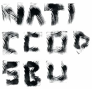
FoundationsOne might assume that familiarity with the basic standards and conventions of typeface construction would be sufficient to start designing a font. What those conventions don’t reveal, however, are the challenges they impose in achieving them: Designing a font for extensive reading that requires a consistent gray texture, in which all the letters appear to have the same proportion and strokes of the same weight, for instance, is not an exercise in measuring. The variety of stroke shapes and their individual kinds of movement, of joints between them, and of the counters that glue them all together, necessitate throwing out the ruler. Ultimately, letterform design is a game of optical illusions that compensate for these differences to ensure the perception of consistency—what is, and what appears to be, are almost never the same. |
|
|
|
|
|---|---|---|
ReinventionOne of the most fascinating aspects of letterform design is how robustly flexible it is—the basic shapes of characters may be revised and reformed in almost infinite ways, creating new styles from within a strict, and seemingly limited, number of variables. This freedon can be attributed to the iconically distinct recognizability of the various letters’ forms; if an A looks enough like an A, for example, it will read as such, and it takes a lot of manipulation to render an A unrecognizable. Taking liberties to transcend mere function and impart meaning, or narrative, is fundamental to developing display faces, titling and, most especially, brand marks, where conveying ideas beyond the explicit is critical. Designers who understand historical precedent are, oddly, in a better position to liberate their investigations from historical models and so innovate new forms with great integrity, formal sophistication, and resonance. |
The State of the ArtSince 1990, the number of available typefaces has increased more than tenfold— from perhaps 30,00 to nearly 500,000, based on some current estimates. Add to that an uncountable number of letter signs, wordmarks, and titling treatments, and the magnitude of typographic exploration approaches the astronomical in scope. Whether created for extensive reading in an editorial context or for a single product name on packaging, each exploits knowledge of the discipline’s history and respect its precedents—even when the project’s or designer’s goal is to fight them and reinvent accepted forms to create something new.”—Timothy Samara |
Some letterform variables can be used to categorize typefaces into specific Style Category groupings:
- Serif
- (the slope or “bracket” that transitions from the stroke of the letter to the serif is a specific characteristic that is in combination with and varies with the type of serif that is used.)
- Old Style Roman

- Transitional Roman
- Modern Roman

- Slab
- Sans-serif
- Script
- Novelty
- Calligraphic
Type variable of Horizontal Scaling (this, as well as vertical scaling, is obviously a method of distortion. Use only with extreme discretion.)


- Condensed
- Extended
Type variable of Posture (Forward posture is normally referred to as Italicizing the form. Its specific form of emphasis usually results in implying a personal statement. Back slant is rare, and would qualify as a special effect. Besides these two extreme postures, most typefaces are quite vertical or close to it.)


- Italics
- Backslant
Type variable of Stroke Weight (this is different from the overall width of a letter. It refers to the stroke only.)


- Variable-weight
- Mono-weight
- thin/light
- regular
- semi bold
- bold
- ultra bold
- Heavy
- Black
Type variable of x-Height (Generally speaking, an x-height that is above mid-point will result in greater readability without increasing the point size of the letter. Conversely, an x-height that is lower than mid-point will lower readability but will generally be regarded as “stylish”.

